
Our logo rankings continue with the Pittsburgh Penguins coming in at No. 8. The skating penguin, once tangled up in blue, was freed in the '80s, shunned in the '90s and welcomed back with open arms in the '00s.
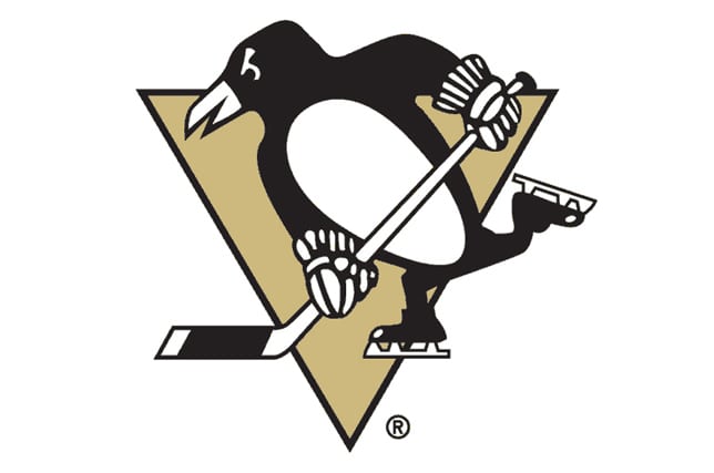 NHL logo rankings No. 8: Pittsburgh Penguins
The Penguins win this Battle of Pennsylvania, but it was close. On Monday, the orange and black of
Philadelphia came in at No. 10 on our list of logo rankings and today, Pittsburgh falls in at No. 8. The skating penguin, who lost his scarf somewhere on the pond, was a fairly popular logo in our discussion, but could have ended up a little higher if the triangle was the yellow it used to be. Think you can design a better logo for the Pittsburgh Penguins? Submit your work to editorial@thehockeynews.com and after our NHL rankings finish next week, we'll share our favorite redesigns sent in by readers. We've got some good ones so far and are hungry for more. All logos below from
Chris Creamer's website.
HISTORY OF THE PENGUINS LOGO “The Penguins? No, really, what will the team be called? You can’t call a hockey team ‘the Penguins.’ That��s ridiculous.” -
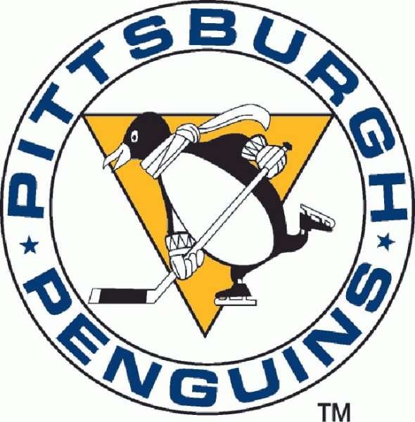
Freelance Pittsburgh artist Bob Gessner in 1967 after the results of a "name the team" newspaper contest were revealed. Gessner, who was paid $1,500 to design six logos for the Penguins, favored the name "Hornets" for the new NHL expansion team. This nickname had been used for the city's American League team from 1936-1956 and again from 1961-67. Plus, he designed the Hornets logo when they returned in the '60s. “How can you make a penguin look mean? They are slow, small and awkward.” The first Penguins logo is what I like to call "Beer League Penguin" because it's the only one with a gut. He's the most happy, harmless looking logo in the team's history, with his smile, wide eyes and dangling scarf. But he didn't appear on a jersey until the 2011 Winter Classic at Heinz Field (the second penguin design was used at the 2008 outdoor game). The Penguins used the beer-leaguer as their primary logo for just one season and though he appeared on pucks and other merchandise, the team's jerseys only had
"Pittsburgh" printed diagonally down the front. Though the Penguins' original primary color was blue, the triangle in the logo represents the city's downtown "Golden Triangle." And, eventually, yellow and black would replace the blue altogether. Learn more about
Gessner's design and other logos he created.
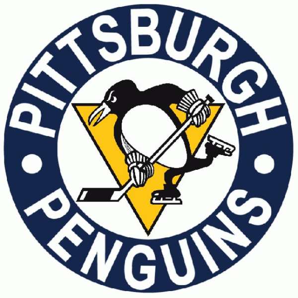
In 1968 the Penguins started putting a logo on their jerseys for the first time, although Beer League Penguin shed the friendly scarf and bulked up over the off-season. You'll notice that on the '68 penguin, his round gut was pushed up to his chest to make him look stronger and his facial expressions became a lot more menacing. Roid Rage Penguin? The circle around the Penguin was also made bolder. The lettering was made larger and turned white, while the background became a dark blue. This logo was used until the early 1970s, when it was altered slightly into a logo we recognize today.
In 1971, the lettering on the logo was removed, leaving the skating penguin on his own for the first time. When you think of this logo today, you might picture Mario Lemieux, Ron Francis, Tom Barrasso and Jaromir Jagr winning Cups in those
classic black and gold jerseys. But for the first eight years after removing the border lettering, this black and gold logo was the
eye-grabbing centerpiece on a blue jersey. In the past, the Bruins had protested Pittsburgh using black and gold as jersey colors, since it was a combination exclusively associated with the Boston squad. This forced the Penguins into a color clash on the jerseys for a while, but in 1980, when the MLB's Pirates ('79) and NFL's Steelers ('80) were champions of their leagues, the Penguins wanted to share the colors of the other professional sports teams in their city. The precedent was there for Pittsburgh to use black and gold, since the
NHL's Pirates used the colors in the 1920s. According to the Penguins' team website, the team first wore black and gold jerseys on Jan. 30, 1980. In about a decade, they'd become a championship team too.
The skating penguin that has been with the team through most of its history took a leave through the 1990s and early '00s. For this, the Penguins receive a major penalty for downgrading their logo and had to feel shame for nearly a decade. It was a curious time to change the logo. The Penguins were a powerhouse, winning back-to-back Stanley Cups with a superstar who had won three Art Ross' and a Hart Trophy at the time. But in 1992-93, Corporate Penguin was introduced to the jersey. Some called it modernizing the logo, but most considered it a huge step back. Blame Howard Baldwin. Making matters worse was a
third jersey that was introduced during the 1995-96 season that would eventually become the full-time road jersey. It took the Corporate Penguin to a new level of terrible.
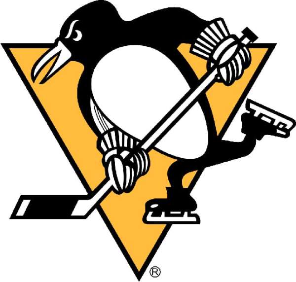
Finally, in 1999-00, the skating penguin returned, albeit to a black third jersey. But since he was off the bench, it was only a matter of time before Corporate Penguin was flushed, hopefully for good. In 2002, the Penguins officially reverted to the old logo, but made a change to set it apart. The bright yellow was replaced with a darker "Vegas Gold" which, in my opinion, keeps it from moving up a little higher in these rankings. Most of the time I'm not a fan of cartoonish logos (it's part of the reason I
dislike Colorado's so much), but I've always enjoyed this one. Never innovate again, Penguins. And if you do ever tweak this logo, just go back to the gold.
Dissenting opinion: "
The Penguins in the Top 10? As Keyshawn Johnson would say: "C'mon man!" Perhaps if they were still rockin' the '90s version it could get consideration for the upper half of the league's logos, but the current incarnation is neither intimidating nor kitschy cute; it's outdated (why is the Penguin still wearing '80s gloves?!), boxy and, quite frankly, boring. Wilkes-Barre is better."
-Edward Fraser, managing editor.
online polls

